Terracotta and light blue living room ideas tend to work for one simple reason: the two colours sit on opposite sides of the colour wheel, so each makes the other look better. Terracotta is a warm, earthy orange-brown. Dusty sky blue is cool and pale. Together they look like a desert at the edge of evening, with baked clay below and a washed-out sky above.
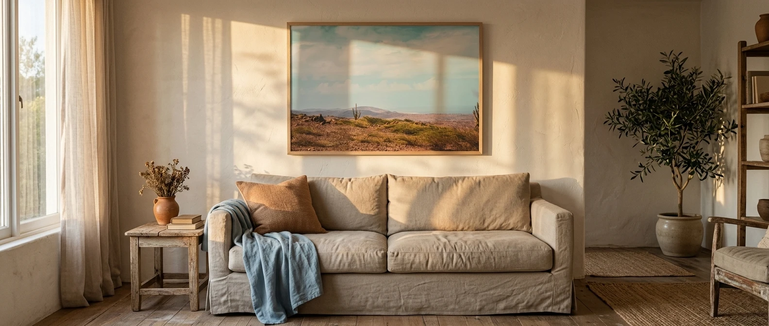
This guide builds one quiet room around those two colours. It covers how much of each to use, where the wall art goes, and which print colours link the palette together. The aim is a room that feels lived in and easy to sit in, not one arranged for a photograph.
Why terracotta and sky blue feel so settled together
Most calm palettes lean on one temperature. All-cool rooms can feel distant, and all-warm rooms can feel heavy by late afternoon. Terracotta and pale blue balance each other, so the eye gets something to rest on in both directions.
Both colours also come from the ground and the sky. Neither is a loud invention, and that is why they look natural next to each other. Fired clay and a hazy sky belong in the same landscape, so the room reads as one place rather than two ideas.
Softness matters here. Both colours need to be dulled, with a little grey in the blue and a little sand in the clay. When neither one shouts, the pairing recedes into the background of daily life, which is what you want from a room you sit in every evening.
Choosing your shades: the dusty blues and softened clay tones that stay quiet
The most common mistake with this palette is picking colours that are too clean. A bright, saturated orange-red with a clear baby blue looks like a theme. Choose shades that look slightly faded, as if the sun has been at them for years.
For the blue, look for:
- A grey-leaning sky blue, the kind that looks almost white in strong light and a little deeper in the evening
- A faint green undertone, which keeps it from turning icy
- Colours described as dusty, washed, chalky or misty
For the terracotta, look for:
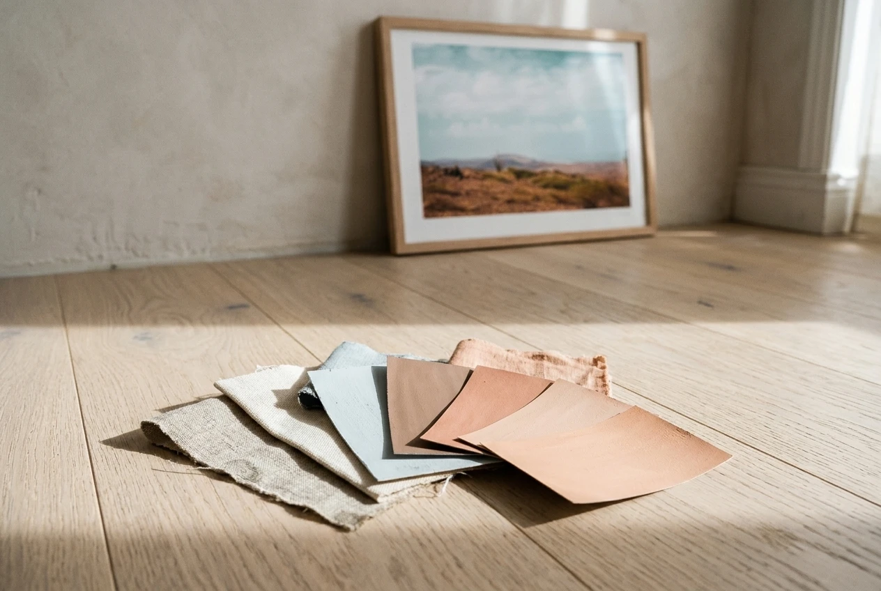
- A clay with some brown in it rather than a vivid orange
- A hint of pink or peach, which softens the warmth
- A matte finish, since glossy surfaces make clay tones look sharper
Test every paint or fabric sample next to the other colour and next to your flooring, in morning and evening light. A blue that looks gentle in a shop can turn cold beside warm wood. Hold the samples together before you commit, and live with them for a couple of days if you can.
How much of each colour: a simple ratio for walls, textiles and wood
A plain rule keeps the palette calm: about 60 percent warm neutral, 30 percent dusty blue, and 10 percent terracotta.
The neutral is the room’s base. It covers the walls, a large rug, and the wood of your floor and furniture. Warm white, oat, sand and pale plaster tones all work, and natural wood counts here because its warmth does the same job.
The blue takes the 30 percent. Put it where there is real surface area: curtains, a throw over the sofa, bed linen, a large cushion pair, or one painted wall. Spreading it over several soft items makes it feel like part of the room’s atmosphere rather than a single bold patch.
Terracotta takes the last 10 percent, and it works best in small, solid objects: a clay pot, a lamp base, a bowl, a cushion or two, the tones in your art. Because it is the warmest and strongest colour, a little goes a long way.
If you love terracotta and want it on the walls, flip the balance. Let a soft clay wall carry the room, then use pale blue for the textiles and keep the rest neutral. Even then, aim for one clay surface, not four. A single wall or an alcove painted in clay is enough.
Three corners to start with: a sofa wall, a bedside, a reading nook
You do not have to redo a whole room. Pick one corner, get it right, and let the rest follow when you are ready.
The sofa wall
Paint or leave the wall a warm off-white, and choose a sofa in a neutral such as oat, stone or soft linen. Add a dusty blue throw and two cushions, one blue and one in a clay tone. Hang one larger piece of art above the sofa, centred and roughly two thirds the width of the sofa, so the wall looks anchored without being crowded.
The bedside
A bedroom can hold this palette well because it is a room you mostly see in soft light. Use blue-tinted bed linen with a single terracotta pillow or a clay lamp on the nightstand. Hang a small print over the bed or beside it, at eye level when you sit up. If you prefer a greener, leafier direction for a small bedroom, the tropical decor ideas for small bedrooms cover that approach.
The reading nook
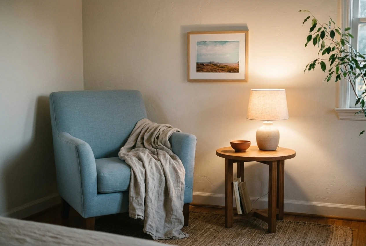
One armchair, one small side table and one lamp are enough. Choose a pale blue chair or a neutral chair with a blue throw, and set a terracotta cup, bowl or plant pot on the table. Hang a small piece of art to the side of the chair rather than directly above it, so it feels like part of the nook and not a focal point. This is the easiest corner to start with because it is small and cheap to change.
Where wall art does the quiet work of tying the two colours together
Paint and fabric set the palette, but wall art is what shows the two colours belong together. A print that contains both terracotta and sky blue acts as a reference point: it tells your eye that the cushion and the curtain are related.
Look for prints where the colours appear together in one scene. Some examples:
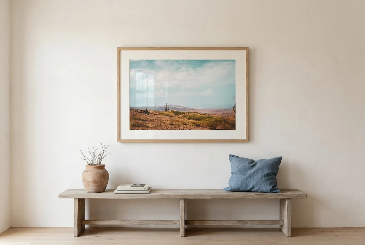
- A soft desert landscape with clay-coloured hills under a pale sky
- A simple sun or moon shape in terracotta on a blue-grey ground
- Abstract arches or curved shapes in clay and dusty blue on warm white
- A line drawing of a cactus or desert plant in clay tones, matted on cream
Place art where it connects with other colours in the room. A print with terracotta in it looks best near a clay pot or cushion, and a print with a lot of blue works well beside curtains or linen. The repeated colour in two places is what makes the connection visible.
Keep frames quiet. Pale wood, natural oak and warm white all suit the palette. Black frames can sharpen the look, which is fine if you want a more graphic room, but they work against a soft feel. A wide mat in warm white gives the colours some breathing room inside the frame.
On spacing, leave generous bare wall around a single piece. One print with space around it reads as calm, while a crowded gallery wall in this palette starts to look busy even when the colours are right.
Warm textures that keep the palette lived in: linen, clay, rattan and worn wood
Colour alone can look flat. Texture is what makes a terracotta and blue room feel like somewhere people actually live.
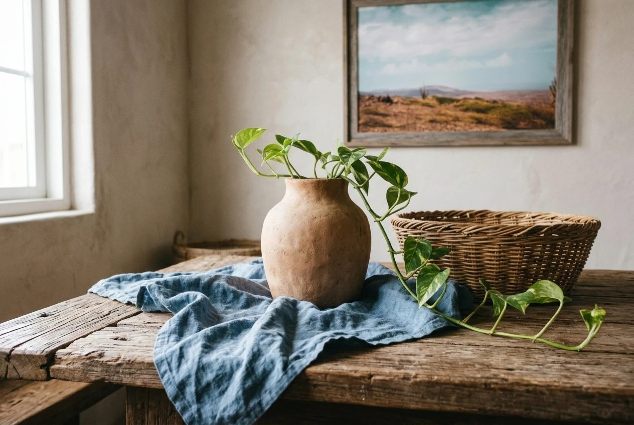
- Linen: Slightly rumpled linen in blue or oat catches light unevenly and softens the edges of a room. It looks better after washing, so do not worry about creases.
- Clay and ceramic: Handmade-looking pots, bowls and vases in terracotta or unglazed clay bring in the warm colour and a hand-formed shape. Slight irregularities add to the effect.
- Rattan and cane: A rattan chair, a woven basket or a cane-front cabinet adds a dry, warm texture in a tone between the blue and the clay.
- Worn wood: A coffee table or shelf with visible grain and a few marks looks more settled than a perfect surface. Wood that is a little faded suits the dusty blue better than dark, glossy wood.
A wool or cotton rug in a flat weave, in cream or a very pale blue stripe, grounds everything without competing with the colours above it. One or two plants, such as a trailing pothos or a dried grass arrangement, add soft green that sits comfortably between the two main colours.
What to leave out when the palette is already doing the talking
Two colours and a few textures are enough. Adding more usually weakens the effect.
- Extra accent colours. Mustard, bright green or black accents compete with the pairing. If you want a third colour, let it be cream.
- Literal desert décor. Cow skulls, cactus-print everything and southwestern patterns on every surface turn a calm palette into a theme. The colours already suggest the desert, so the objects do not have to.
- Many patterns. One pattern, such as a stripe on a cushion or a faint geometric rug, is plenty. Everything else can be plain.
- Shiny metals and glossy finishes. High-gloss surfaces and chrome look hard next to matte clay and linen. Brass that has aged a little, or matte black in small amounts, sits more quietly.
- Matching sets. Cushions, lamps and vases bought as a matching set make the room look arranged. Pieces that are similar in tone but not identical look gathered over time.
A gentle way to pick your first print and build from there
Start with one print, and choose it before you buy anything else. Pick a piece that has both colours in it, then use it as your guide. Pull the blue and the clay from the print when you choose a throw, a cushion cover or a ceramic piece.
Hang it, live with it for a week, and notice what the room is missing. Perhaps the blue needs repeating on the other side of the room, or a clay-coloured object would balance the print. Add one thing at a time and leave the walls with space around them.
Later, a second smaller print can echo the first, either in the same palette or in a quieter neutral version. Two or three pieces in a room are plenty, and each one can have room to be seen.
Browse the desert-toned prints in the Rooms & Prints shop to find a piece that carries both terracotta and sky blue into your room.
Leave a Reply