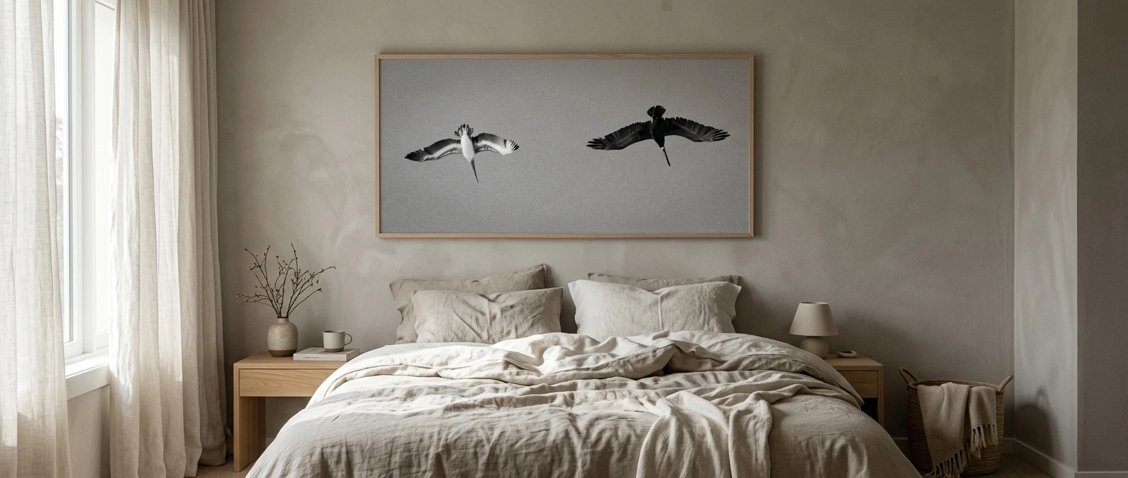
A room in one color family has no contrast of hue to hold your attention, so the eye drifts across the walls, bedding and furniture without stopping. That drifting is why some all-white, all-grey or all-black bedrooms feel restless rather than calm, even though nothing in them is loud. The room needs one object that is clearly the focus.
The simplest way to give it one is a single oversized print. These monochrome bedroom ideas with wall art all rest on that choice: one large piece, a restrained palette around it, and texture doing the work that extra color or extra frames would otherwise do.
Why a monochrome bedroom needs one place for the eye to land
When every surface is a similar tone, the eye looks for a point of difference. If you don’t supply one, it settles on whatever is nearest, usually a stray cable, a laundry basket or the edge of a dresser. A statement print gives it somewhere intended.
One large piece also reads as calmer than several small ones. A gallery of five frames asks you to look at five things, and each frame adds edges, gaps and decisions. A single print asks you to look once, and then you can stop looking.
This is also what keeps a quiet bedroom from feeling like a showroom. A showroom shows everything at equal volume. A lived-in room has a few things you notice and a lot you don’t, and the print is the first kind.
Pick the print first, then the palette around it
Most people choose the paint and bedding first and hunt for art afterward. In a monochrome room, reverse that order. The print sets the tones, and everything else follows its lead.
Look at the darkest and lightest values in the image. A print with soft charcoal and warm off-white tells you to look for bedding in warm white, a throw in stone or oatmeal, and walls that are slightly warmer than pure white. A print with deep black and bright white suits a crisper room with more contrast in the textiles.
Check the undertone, too. Greys and whites lean warm (cream, putty, greige) or cool (blue-grey, paper white). Hold a swatch of your sheets against the print in daylight and again under your bedside lamp. If one looks yellow and the other looks blue, they will argue with each other every evening.
Once the print is chosen, you can take two or three tones from it and use nothing outside that range. That limit is what makes the room feel composed without much effort.
Choose a subject that stays quiet: what to look for in a calm statement print
A bedroom print is looked at while you are winding down and while you are waking up, so the subject should ask very little of you. These qualities tend to work:
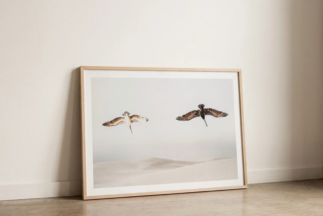
- Soft edges and gentle gradients. Fog, mist, sand dunes, a blurred horizon or a wash of ink hold up better in a bedroom than sharp, high-contrast graphics.
- Plenty of empty space inside the image. Open areas in the print let the eye rest within it, which carries the calm of the room into the artwork itself.
- Abstract or near-abstract forms. A single curve, a brushstroke, a pale arch or a quiet landscape reads the same at 7 a.m. and at midnight. Faces, text and busy scenes keep telling you something.
- A narrow tonal range. If the print runs from one soft grey to another, it stays in the background even at large scale.
What to avoid is more specific than “busy.” Avoid anything with a strong diagonal or an obvious focal point that pulls you toward one corner, any slogan or quote, and images with a lot of small detail that rewards close study. Those suit a hallway or an office, where you pass by and look on purpose.
A photograph of a landscape can work, as long as it is muted. A close crop of a plain subject, such as a single branch or the line of a hill, often feels calmer than a wide scene.
Size and height: getting the scale right above the bed
The most common mistake with a statement print is buying it too small. A modest frame above a king-size headboard looks like it got lost on the wall. In a monochrome room, where nothing else competes, undersized art looks like an afterthought.
A reliable rule of thumb is to make the artwork roughly two-thirds to three-quarters of the width of the bed or headboard. If your bed is wide, one large piece will do the job better than two mid-size ones side by side. If the print you love only comes in a smaller size, a generous mat inside a larger frame can bring up the overall dimensions.
For height, leave a visible gap between the top of the headboard and the bottom of the frame. A gap of several inches is usually enough for the two to look related without touching. Hang it too high and it floats away from the bed. Hang it too low and you will hit it with your head when you sit up against the pillows.
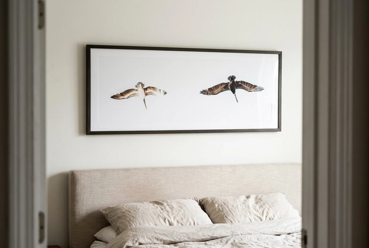
Before you drill anything, cut a piece of paper or cardboard to the frame’s outer size and tape it to the wall. Leave it there for a day or two, and look at it from the doorway and from the bed. Adjust the height until it looks settled from both places.
Frame and mat choices that keep the look soft, not stark
The frame is part of the print’s presence, so it should follow the room’s palette and not announce itself.
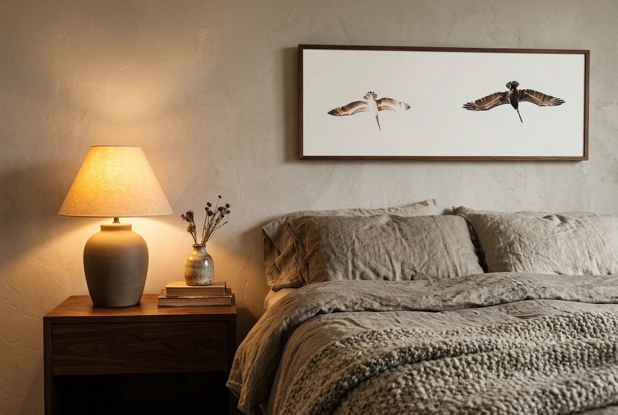
Wood frames add warmth and suit nearly every monochrome scheme. Pale oak and ash feel light and Scandinavian. Walnut and other darker woods add depth to a pale room. A natural wood edge is also a first piece of texture before you reach the bedding.
Thin black frames give a crisper, more graphic look. They work well when the print itself has strong darks, and they can look severe in a very pale room, so pair them with plenty of soft fabric nearby.
White or off-white frames make the print seem to float on the wall. They are a good choice for a very light room, though a pure bright white can look clinical, so a slightly warm white is kinder.
A mat is worth including if the print has fine tonal detail. A wide, warm white or soft grey mat gives the image breathing room and softens the edge between artwork and wall. Match the mat to the lightest tone in the print and not to a brighter white, which makes the image look dull by comparison.
Glass can reflect a window or lamp straight back at you. If the print will face a window, look for non-glare glazing or an acrylic front.
Let texture carry the room: linen, wool, wood and ceramic
When color is restricted, texture is what stops the room from looking flat. Different surfaces catch the light differently, so even a bedroom built from three neutral shades will have variation you can see and feel.
- Linen on the bed has a slightly rumpled surface that looks relaxed and lived-in. It does not need to be ironed, and creases suit this look.
- Wool in a throw, a rug or a heavy blanket at the foot of the bed adds weight and softness. A chunky weave shows up well in a plain palette.
- Wood in a bedside table, a bench or the frame itself brings in grain and a natural warmth that painted surfaces cannot.
- Ceramic in a lamp base, a small vase or a dish on the nightstand adds a matte or glazed finish. Choose pieces in the same tonal family as the print.
Vary the scale of the textures as well as the materials. A coarse weave next to a fine one, a smooth ceramic next to a rough wool, will do more than adding another object. Keep the surfaces themselves in the same few tones, and the room reads as one calm space with a lot of quiet detail.
This is also where the warmth comes from. A monochrome room feels cold when everything is smooth and hard. It feels personal when things look touched and used: a folded throw, a well-worn wooden stool, a lamp with a slightly imperfect glaze.
Where the print can go if the wall above the bed is not an option
Not every bed has a clear wall behind it. A sloped ceiling, a window, a shelf or a built-in headboard can rule out the usual spot. The print can still be the focus of the room in another position.
- The wall opposite the bed. This is what you see when you lie down and when you wake, so it often matters more than the wall behind your head. It is a strong choice for a large print.
- Leaning on a dresser or a long low shelf. A big frame propped against the wall looks relaxed and is easy to change. Lean it slightly off-center for an informal feel, or center it for a calmer one.
- Over a bench or a chest at the foot of the bed. This works if the bed sits against a wall with a window or a door.
- Beside a window, on the wall that catches the morning light. The print changes with the day, which suits soft, tonal images.
Whichever place you pick, keep the same approach: one large piece, a clear gap around it, and nothing competing within a hand’s width of the frame.
What to leave out so the print stays the statement
Restraint is most of the styling. A print does its job when the area around it is quiet, so a few additions are best skipped:
- Additional art on the same wall. One small frame next to a large print halves the effect of both.
- Extra colors. A single accent, such as a rust cushion, can work in some rooms, but it moves the focus away from the print. If the room is meant to be monochrome, hold to it.
- Layers of decor for their own sake. Plants, baskets, trays and candles in large numbers dilute the calm. A bedroom with lots of botanical pieces is a different style and a good one, covered in tropical decor ideas for small bedrooms, but it works by abundance, and this one works by omission.
- Matching sets. Two identical lamps and two identical frames can look staged. Pieces in the same tones that differ in shape look gathered over time.
- Clutter on the surfaces nearest the print. The bedside tables and the headboard shelf frame the artwork, so keep them to a lamp, a book and a glass of water.
After you have hung the print, live with the room for a week before you add anything. If the space already feels settled, stop there. A calm bedroom is mostly a matter of not adding the next thing.
Browse the Rooms & Prints collection to find a calm statement print for your bedroom wall.
Leave a Reply